
The Art of Responsive Website Design
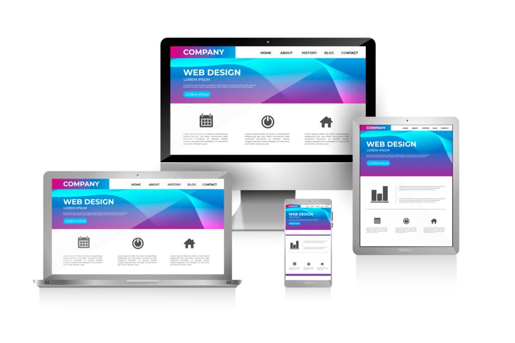
In the dynamic landscape of web development, creating websites that seamlessly adapt to various devices and screen sizes is imperative. Responsive design has emerged as a cornerstone principle, ensuring optimal user experiences across desktops, tablets, and smartphones. In this comprehensive guide, we’ll delve into the essential techniques and best practices for mastering responsive design, empowering developers to build websites that are not only visually stunning but also functionally robust and accessible to all users.
1. Know the basics
Responsive design is a holistic approach to web development that prioritizes flexibility and adaptability. At its core, it involves designing and coding websites in a way that allows content to adjust fluidly based on the device’s screen size, orientation, and resolution. Rather than creating separate versions of a website for different devices, responsive design enables a single, unified web experience that seamlessly transitions across platforms.
- Responsive design ensures websites adapt seamlessly to various devices and screen sizes.
- It prioritizes flexibility and adaptability, offering a unified web experience across platforms.
- Core principles include fluid grids, flexible layouts, and media queries for device adaptation.
2. Embracing Fluid Grids and Flexible Layouts
Central to responsive design is the concept of fluid grids and flexible layouts. Instead of relying on fixed pixel-based measurements, developers utilize relative units such as percentages or ems to define layout dimensions. This enables content to expand or contract proportionally based on the user’s device, ensuring that elements maintain proper alignment and spacing regardless of screen size.
- Utilize relative units like percentages or ems for layout dimensions.
- Content adjusts fluidly based on the user’s device, maintaining proper alignment and spacing.
- Flexible layouts ensure optimal display across different viewport sizes and orientations.
3. Harnessing Media Queries for Device Adaptation
Media queries are powerful CSS features that allow developers to apply styles based on specific device characteristics, such as screen width, height, or orientation. By strategically implementing media queries within their stylesheets, developers can create custom layouts and optimize design elements for different viewport sizes. This granular control over styling enables websites to deliver tailored experiences that cater to the unique needs of each user.
- Media queries enable applying styles based on specific device characteristics.
- Customize layouts and optimize design elements for different viewport sizes.
- Granular control over styling ensures tailored experiences for users on various devices.
4. Prioritizing Content and Progressive Enhancement
In the era of responsive design, prioritizing content is paramount. Developers employ a technique known as progressive enhancement, which involves designing websites with a focus on core content and functionality first, then adding enhancements for larger screens and more capable devices. This ensures that users on all devices receive essential content and features, with additional enhancements enhancing the experience for those on larger screens.
- Design with a focus on core content and functionality first.
- Enhancements are added progressively for larger screens and more capable devices.
- Users receive essential content across all devices, with additional enhancements for larger screens.
5. Leveraging Flexbox and CSS Grid for Layout Flexibility
Flexbox and CSS Grid are advanced layout tools that offer unparalleled flexibility and control over website layouts. Flexbox excels at creating dynamic, responsive layouts with complex alignment and distribution, while CSS Grid enables developers to design multi-dimensional grid structures with ease. By leveraging these modern layout techniques, developers can streamline their workflow and create intricate designs that adapt seamlessly to different viewport sizes.
- Flexbox offers dynamic, responsive layouts with complex alignment and distribution.
- CSS Grid enables the creation of multi-dimensional grid structures with ease.
- Modern layout techniques streamline workflow and facilitate intricate designs adaptable to different viewport sizes.
6. Optimizing Images and Media Assets
Image optimization is crucial for responsive design, as large, high-resolution images can significantly impact page load times and user experience on mobile devices. Developers employ techniques such as responsive image scaling, lazy loading, and the use of WebP or SVG formats to minimize file sizes and ensure fast, efficient loading across all devices. Additionally, video and other media assets should be optimized for bandwidth and playback performance, further enhancing the overall user experience.
- Responsive image scaling ensures optimal display across devices.
- Techniques like lazy loading and format optimization minimize file sizes for faster loading.
- Video and media assets are optimized for bandwidth and playback performance.
7. Testing and Debugging Across Devices
Thorough testing is essential to ensure the effectiveness of responsive design techniques. Developers utilize a variety of testing tools and techniques to evaluate website performance across different devices, browsers, and screen sizes. Responsive design testing frameworks such as BrowserStack or Responsive Design Checker allow developers to simulate how their websites appear and function on various devices, facilitating comprehensive bug identification and resolution.
- Use testing tools to evaluate website performance across devices and browsers.
- Responsive design testing frameworks simulate website appearance and functionality on various devices.
- Comprehensive testing facilitates bug identification and resolution for optimal user experience.
7. Embracing Accessibility and Inclusive Design Principles
Inclusive design is an integral aspect of responsive design, ensuring that websites are accessible to users of all abilities. Developers adhere to accessibility standards such as the Web Content Accessibility Guidelines (WCAG) and implement features such as keyboard navigation, screen reader compatibility, and color contrast optimization to enhance accessibility. By prioritizing inclusivity in their design process, developers create websites that are usable and enjoyable for everyone.
- Adhere to accessibility standards like WCAG to enhance inclusivity.
- Implement features such as keyboard navigation and screen reader compatibility.
- Prioritize inclusivity in the design process to create websites usable by everyone.
Conclusion
Responsive design is not merely a trend but a fundamental requirement in today’s digital landscape. By mastering responsive design techniques, developers can create websites that adapt seamlessly to the diverse array of devices and screen sizes used by modern audiences. From fluid grids and media queries to advanced layout tools and accessibility considerations, responsive design empowers developers to craft immersive, engaging web experiences that resonate with users across platforms. As technology continues to evolve, embracing responsive design principles will remain essential for staying ahead of the curve and delivering exceptional digital experiences in a rapidly changing world.
Contact Us
Our Website Services
Customized Website Solutions

Looking for a Partner to build your website? We’ve got you covered.
With a proven track record in web development, we excel in creating top-tier E-commerce and Banner websites that drive results. Whether you’re looking to establish a robust online store with seamless shopping experiences or need eye-catching banner websites that will captivate your audience, Whether you want to use WordPress or Shopify we have the expertise to make it happen.
One Media Digital Solutions
At One Media Digital Solutions we’re committed to transforming your vision into reality. Our team of skilled professionals strives for excellence in every project we undertake. Whether it’s crafting innovative software solutions, designing captivating websites, or building robust applications, we’re here to exceed your expectations.
Quick Contact
Email us

Want a Quote? Have a Quick Question? Need a Quick Answer?
Want a Quote?
Have a Quick Question? Need a Quick Answer?
Message us and we will get back to you as soon as we can..